Project Detail
Entering a new product category demands more than a new label. It demands a rethink of how a brand communicates — while protecting everything it has already built.
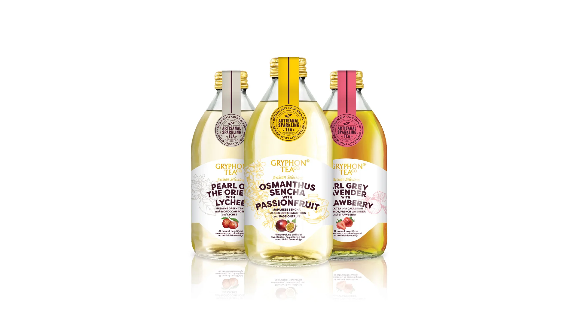
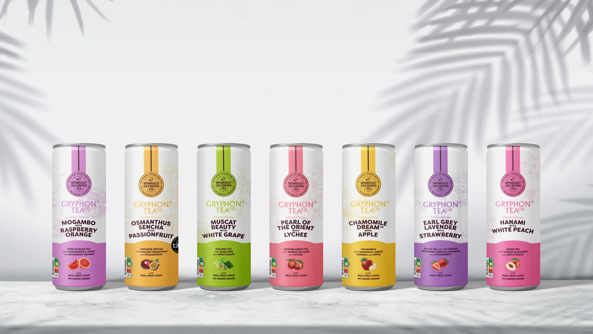
For Gryphon Tea Company’s inaugural sparkling tea range, Leap developed an entirely new design direction that addressed both the novelty of the product and the integrity of the brand. A simplified logo was created to suit the new format. A fresh colour palette — cream, gold, and rose — was introduced to distinguish three flavours while maintaining visual harmony across the range. Botanical illustrations were reimagined for the sparkling tea sub-brand, drawing on the aesthetic language of the existing Artisan Selection range without replicating it.
Complementing the packaging, a full-page magazine advertisement was designed for the product launch — bold, celebratory, and unmistakably Gryphon.
The three variants — Pearl of the Orient with Lychee, Osmanthus Sencha with Passionfruit, and Earl Grey Lavender with Strawberry — each hold their own while telling a unified story on shelf.
Sometimes, the most important design decisions are the ones that know what to keep.