Project Detail
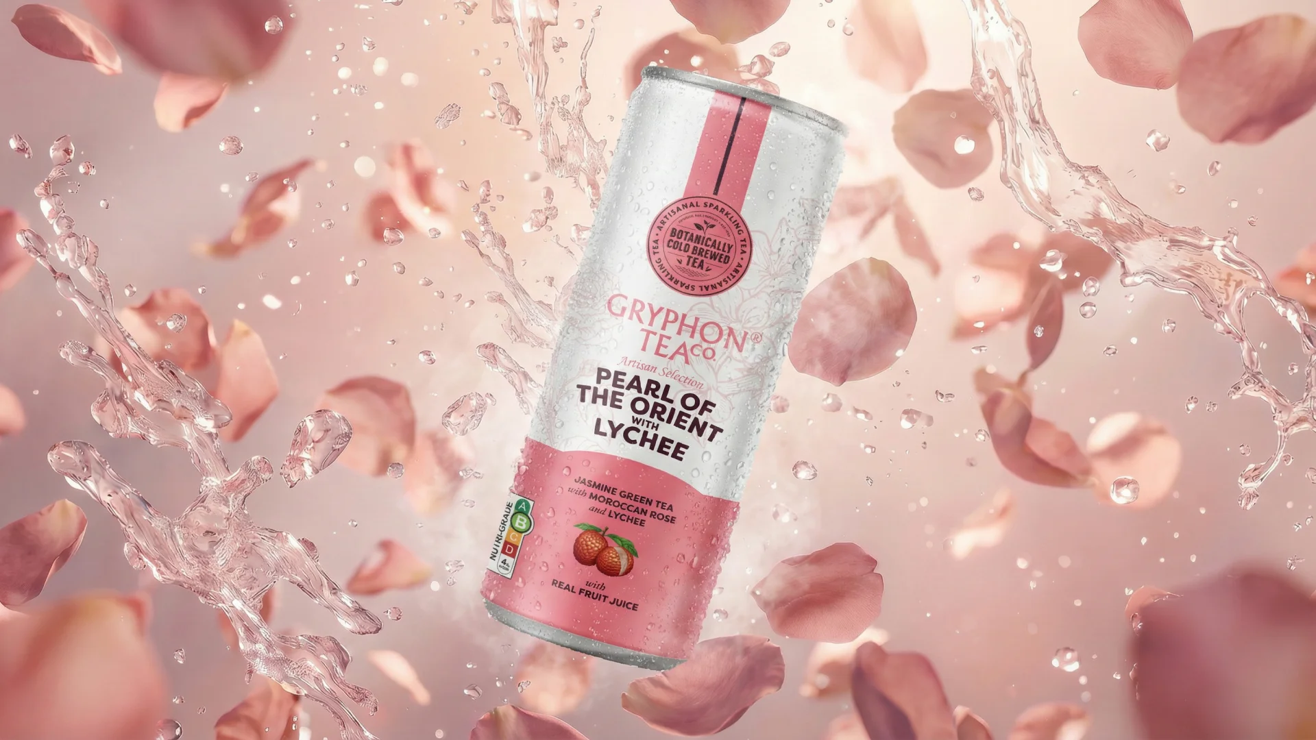
Gryphon Tea Company has been one of Singapore’s most quietly distinguished tea brands for decades. When the time came to launch a new Cold Brewed Sparkling Tea range, the ambition was clear — to bring the same depth of flavour curation that defined their loose-leaf heritage into a contemporary, ready-to-drink format without losing what made the brand worth reaching for in the first place.
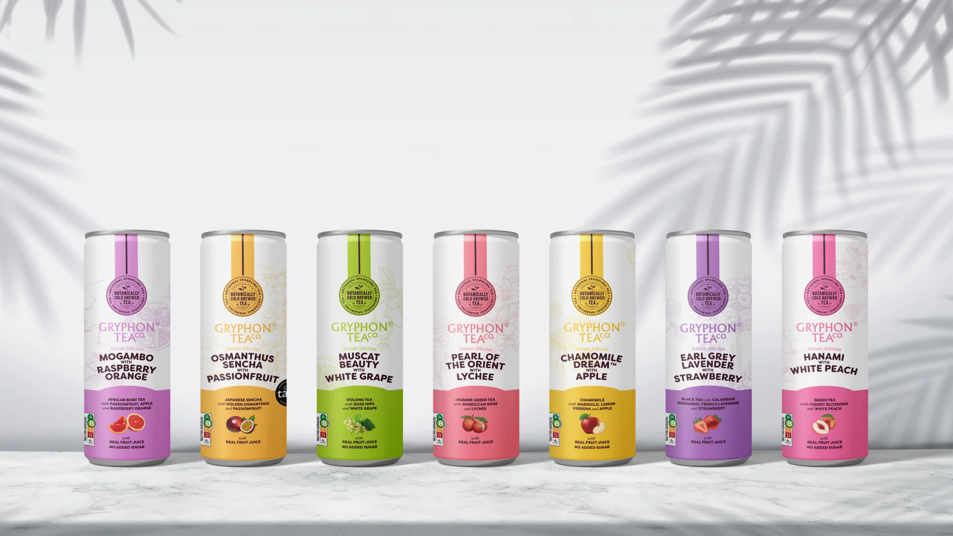
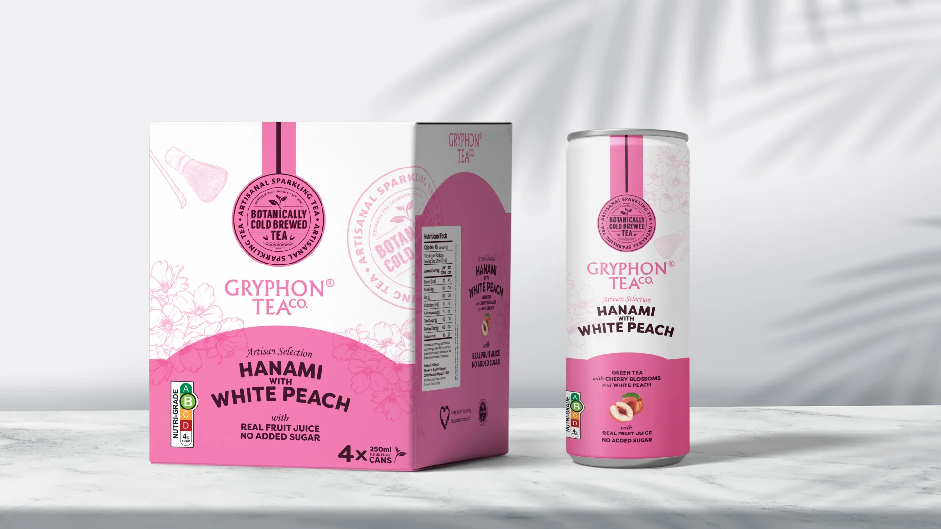
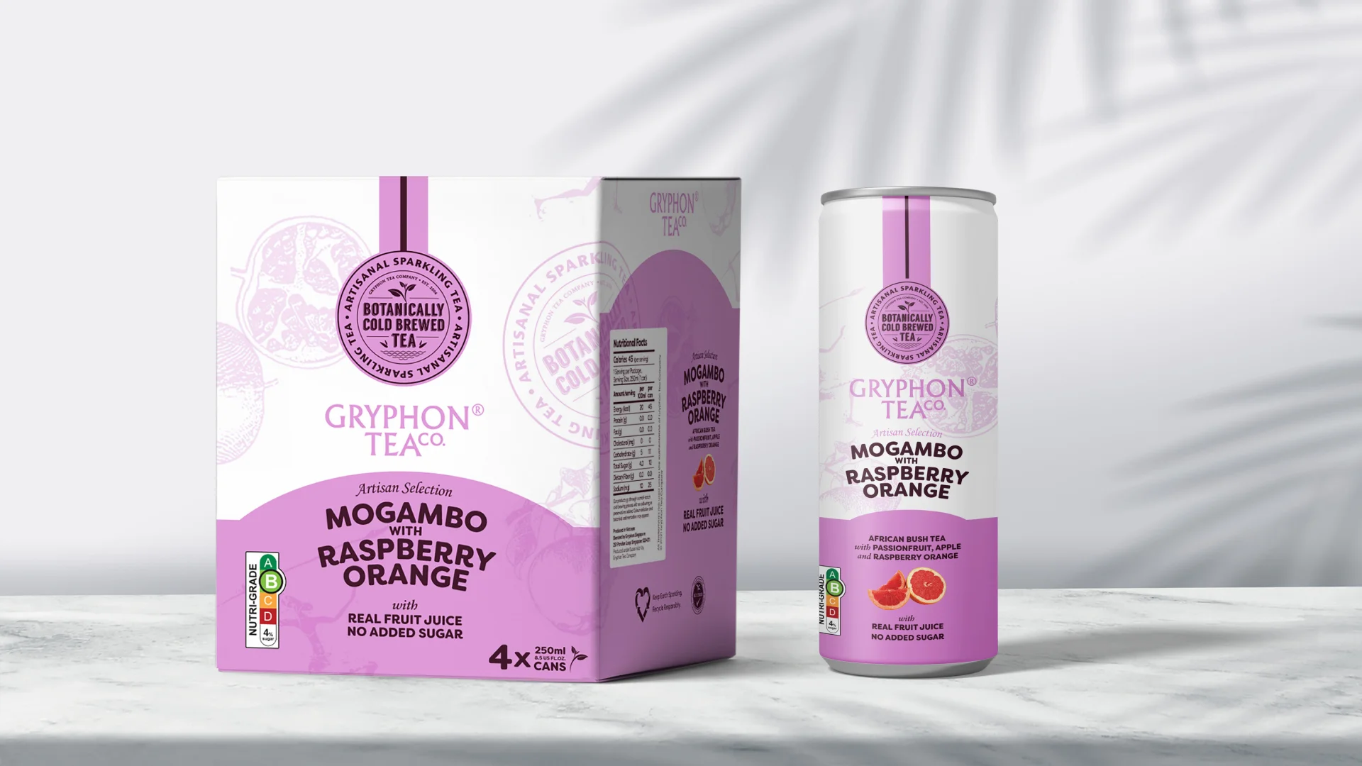
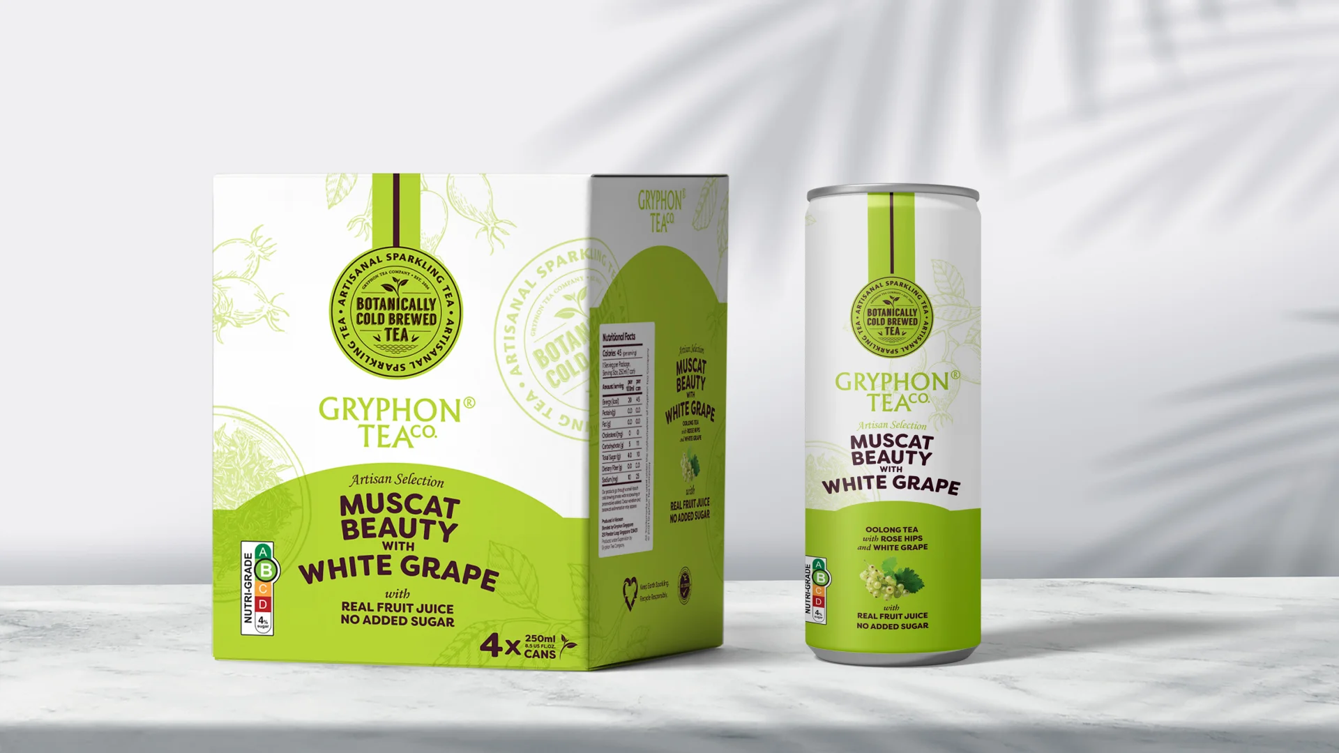
Designing a multi-SKU range is a balancing act between variety and coherence. The challenge was giving seven distinct botanical blends their own identity whilst holding them together as an unmistakable family.
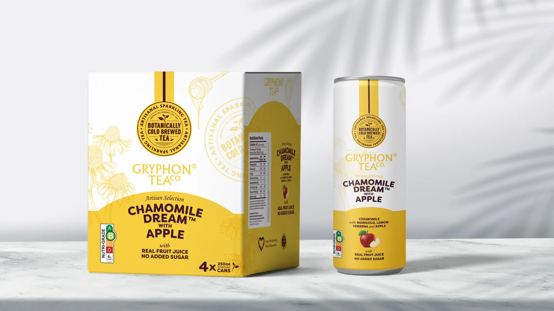
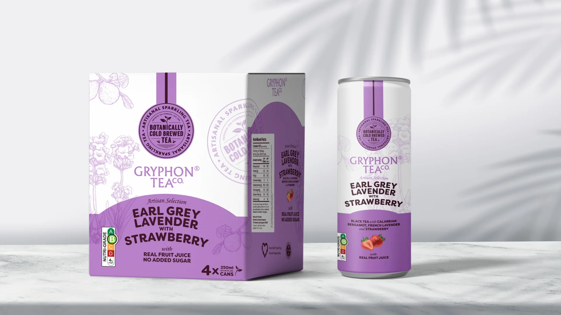
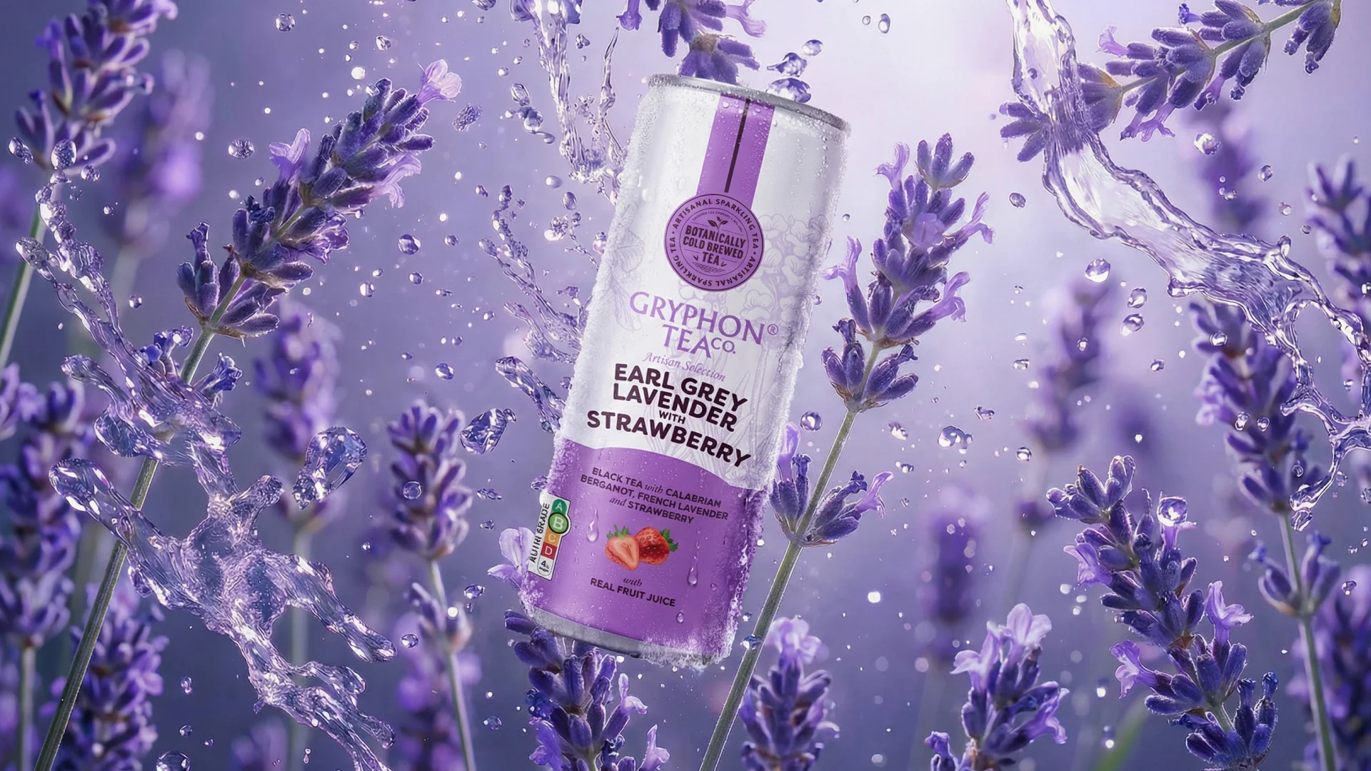
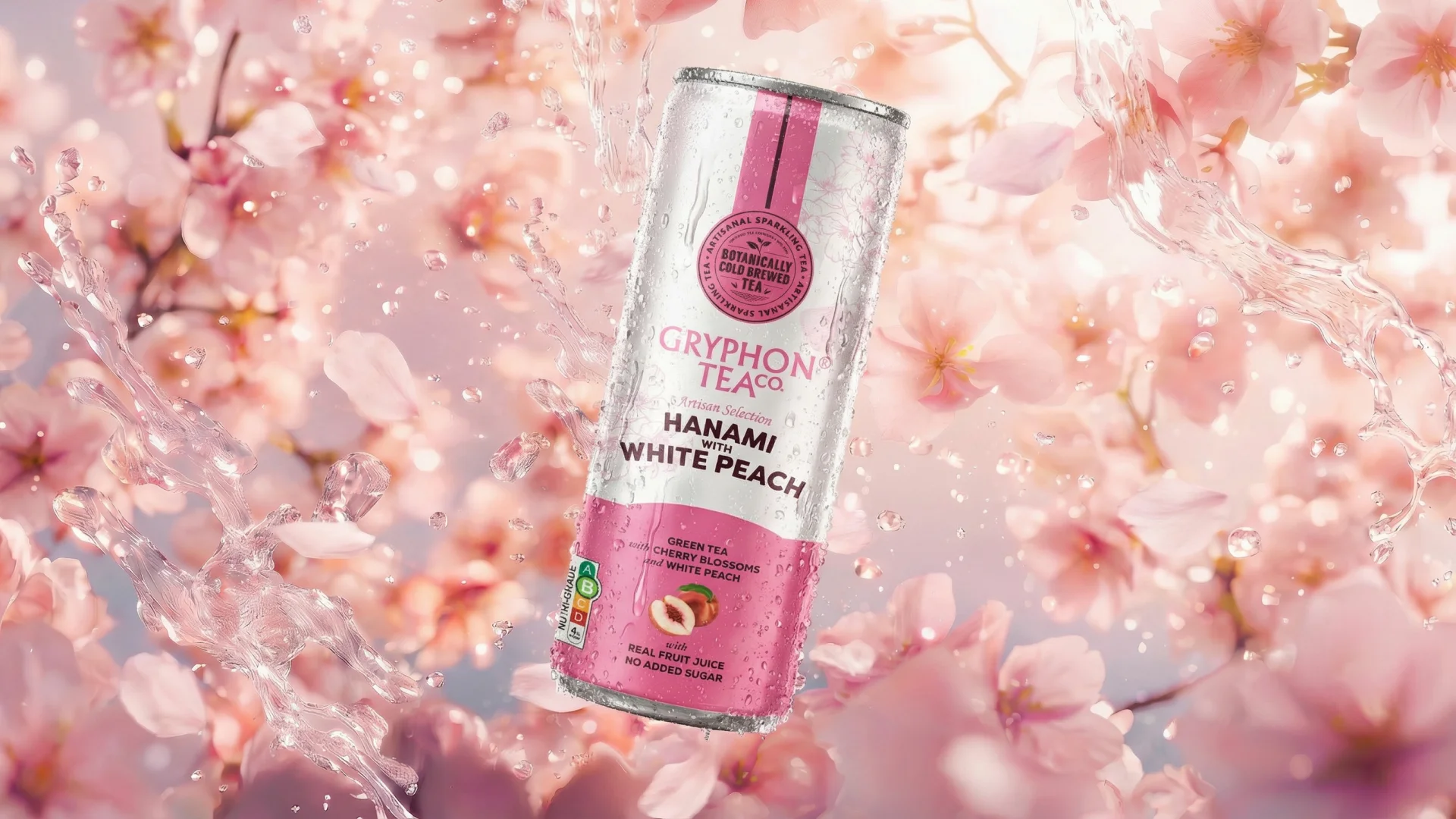
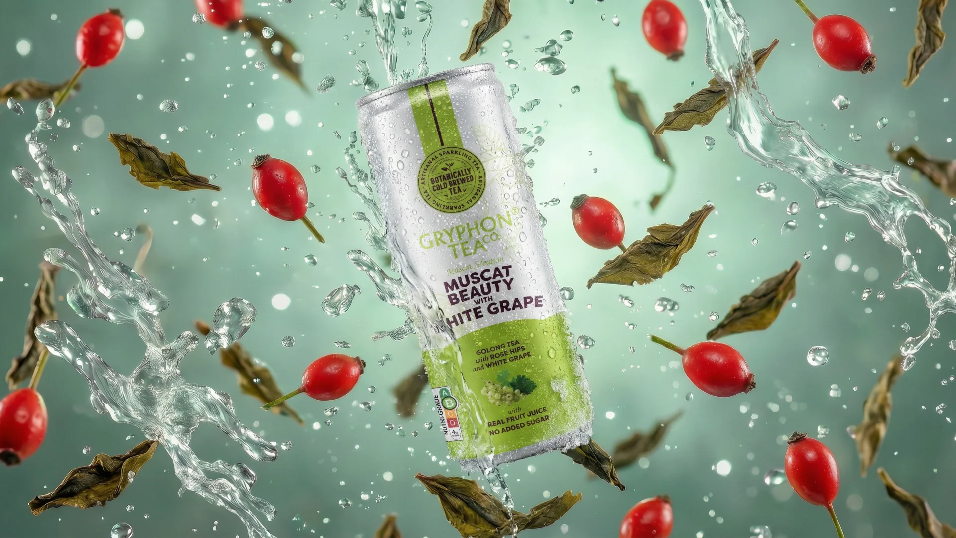
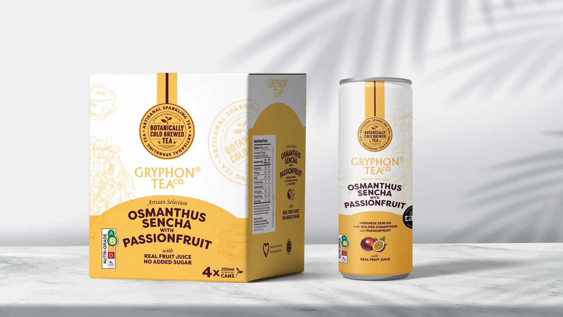
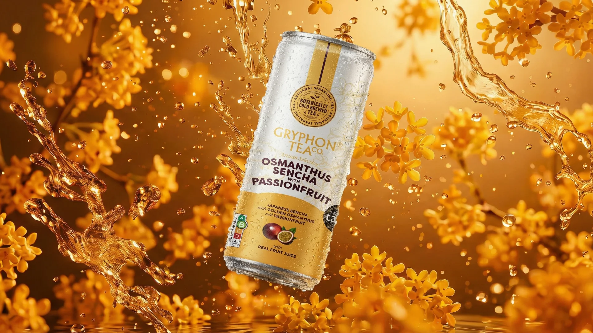
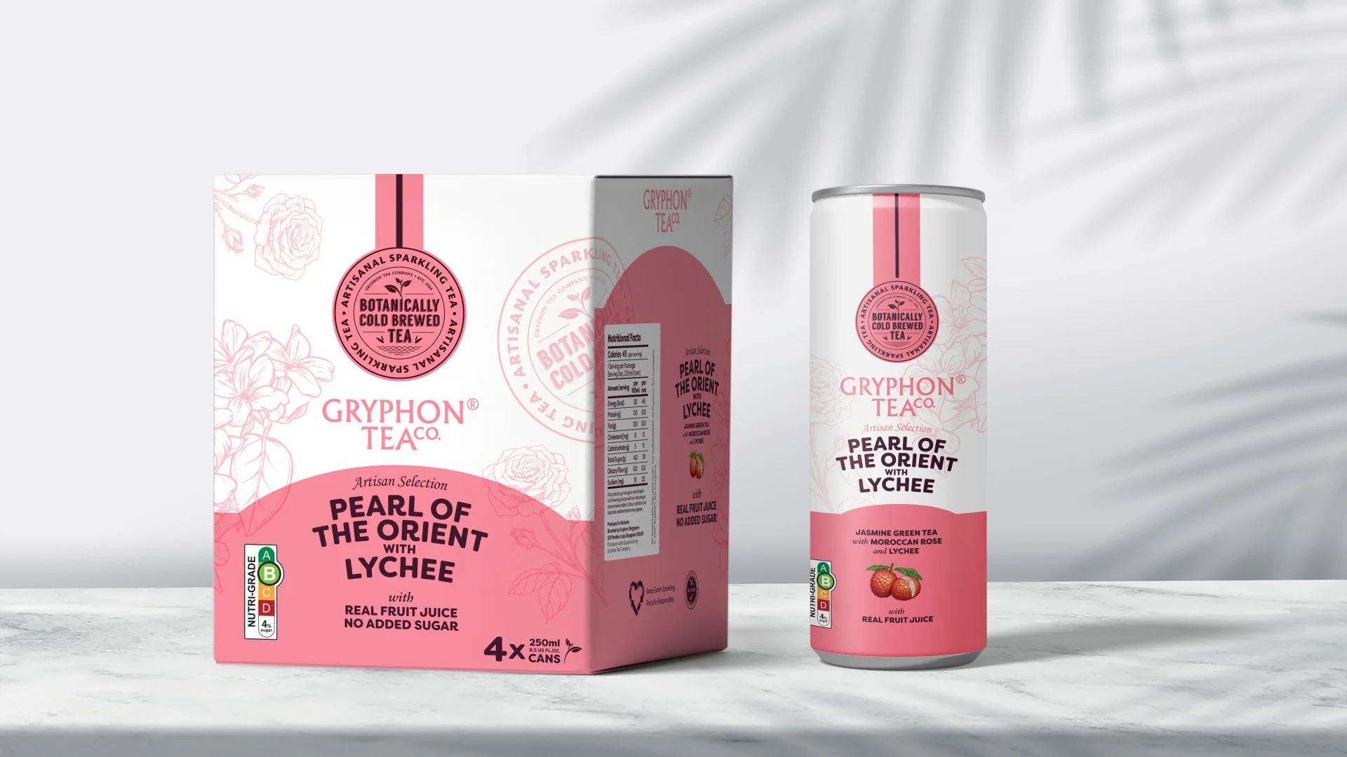
The solution was a structured design system built on a clean white body — refined and premium — anchored by bold, flavour-coded colour bands that shift confidently from chamomile gold to lavender mauve to cherry blossom pink. Each variant carries its own botanical line illustration, a quiet nod to the artisanal nature of the product. The “Artisan Selection” designation and “Botanically Cold Brewed Tea” badge add provenance and trust without cluttering the visual hierarchy.
Typography does the heavy lifting on shelf — the product names are bold, legible, and expressive, designed to read at a distance and reward closer inspection. The multipack boxes mirror the can design faithfully, extending the system across both retail formats.